Whenever I open a paper, the first thing I do is glance at the title and then immediately move on to the figures. Figures provide a visual narrative that summarizes the core message of a study. The cleaner, clearer, and more effective they are, the more attention they attract, the more likely they are to be read, and the more easily they are understood. In fact, I often decide whether a paper is worth reading based solely on its figures and captions. That’s why figures are not merely “extra information”; they are the backbone of scientific storytelling.
One anecdote always comes to mind. During my PhD, a colleague printed out a figure and brought it to our advisor, Prof. Philip Withers. The text on the figure was so small that, without hesitation, our advisor turned around, grabbed a magnifying glass from his desk, and used it to examine the figure. His silent yet powerful message was clear: if a figure needs a magnifier to be read, it simply won’t be read. Since that day, I always ask myself, “Can this figure be understood without a magnifying glass?”
I had a similar experience myself. I once brought tensile test results to my advisor for discussion. As I placed the graph on the table, he looked at it and simply asked, “What are these axes?” He obviously knew the answer but was highlighting that my figure conveyed nothing. I hadn’t provided any information about the test conditions, number of repetitions, or the meaning behind the colors. It was just raw data. That moment taught me a valuable lesson: generating data isn’t enough, presenting it meaningfully is just as important.
This realization has deeply shaped my paper-writing practice. I always prepare figures before writing the text. I structure the narrative around them, deciding how to present each dataset in a coherent flow. I write a short paragraph under each figure to clarify my intentions, which not only strengthens the figure’s impact but also provides the skeleton for the paper. In fact, our initial research group meetings often revolve around the figures, using them to establish the flow of the narrative.
In this article series, I will share my figure preparation workflow based on personal practice. The first piece will cover general principles and key points to consider. In subsequent parts, we’ll work through examples step-by-step.
If you’re ready, let’s begin.
Step 1: Is This Figure Really Necessary?
Every figure should tell a story. But not every story requires a figure.
Start by asking yourself:
- Will this figure make it easier for the reader to understand?
- Can I communicate the same information effectively in a well-written paragraph?
- Would the narrative of the paper be incomplete without this figure?
- Does this figure support one of the main messages of the paper?
Avoid adding figures just because you have the data. Each one must serve a purpose. Remember, more figures increase the risk of distracting the reader.
Step 2: Choosing the Right Format Based on Data Type
Data is valuable, but how you present it matters just as much. You can present the same result using three different graph types, but only one will leave a lasting impression.
Ask yourself: “How can I present this data so the reader quickly grasps what I mean?”
Below are common data types and the most suitable figure formats for each:
- For Comparisons: Make the Differences Clear
- Bar Chart: Great for comparing values across categories. Immediately shows which sample is stronger or weaker.
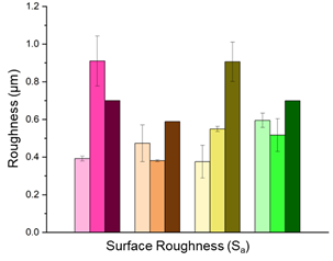
Figure 1. An example bar chart illustrating surface roughness values [ ]
- Boxplot: Not only shows the mean but also describes the distribution. If you aim to highlight variation and outliers, it is indispensable.
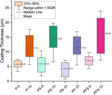
Figure 2. Boxplot representation of post-production coating thicknesses for samples with different coating thicknesses.
Figure 2 is a boxplot comparing the distribution of three different groups. Such plots are ideal for visually presenting statistical information such as the median, quartiles, outliers, and the overall range of the data.
- Scatter plot: In Figure 3, a simple scatter plot illustrating the relationship between X and Y is presented. These types of plots are ideal for visualizing the correlation between two continuous variables.
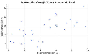
Figure 3. An example scatter plot demonstrating the relationship between the dependent and independent variables.
- For Time-Dependent Data: Use Line Charts
- Line chart: By far the most powerful type of graph for time series. For anything that changes over time—degradation, fatigue, diffusion, and so on.
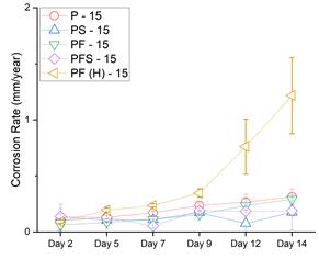
Figure 4. Line chart showing the time-dependent change in corrosion rate among different samples.
- Error band: Do not just display the line; also indicate how reliable it is, for example with a confidence interval or standard deviation.
- For Structure: Invest in Visual Clarity
- SEM / OM / X-ray görüntüleri: In these figures, clarity is just as important as aesthetics. Presenting an image without a scale bar is like drawing a route without a map.
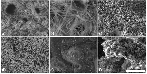
Figure 5. Regions with different morphologies observed by SEM after the corrosion test.
- EBSD / EDS maps: Colors should convey information. Using different colors for the same element in different figures leads the reader to disregard the map.
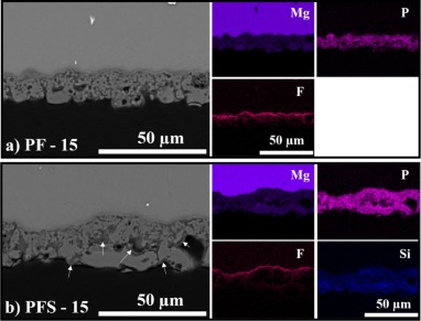
Figure 6. Cross-section images of PF (a) and PFS (b) coatings after the corrosion tests and their corresponding EDX maps.
- Overlay: Overlaying two different features of the same structure (e.g., morphology + composition) is an intelligent way to present more information in less space. Check the graphica abstract at the top of the page. It has several maps overlaid. Of course, we will talk about them later.
·
- For Modeling Results: Be Strategic
- Contour plot / Heatmap: Stress, temperature, diffusion… areas of concentration or potential hazards are revealed at a glance.
- Mesh visualizations: Essential for demonstrating how “clean” or well-constructed your finite element model is.
- Deformation maps: Where numbers fall short, visualizing shape change tells the story. Arranging sequential model images over time can create an animation effect. I will present related images in one of my upcoming articles.
Reminder:
How you present your data determines how much the reader trusts you. Telling a complex story through a simple figure is true craftsmanship.
In this first part, we covered the essential steps of figure selection, choosing the right format, and how to match your data to the most impactful type of visualization. In the next part of this series, we’ll dive into the practical aspects of visual design: using color effectively, picking the right fonts and hierarchy, and how to write captions that actually help the reader interpret your work.
Stay tuned for the next post, where we’ll carry on a step-by-step guide to figure preparation!