So far, we’ve discussed whether a figure is truly necessary and how to choose the correct format. But now it’s time to tackle the most striking aspect of all — the aesthetic intelligence of figure design. Ready? Let’s dive into the scientific power of colour, typography, and visual hierarchy.
Step 3: Use of Color, Fonts, and Visual Hierarchy in Figure Design
Scientific accuracy alone is not enough. Because when a reader first glances at your figure, their attention doesn’t go to the numbers — it goes to shapes, colours, and structure. The eye chooses beauty first, and only then does the mind seek meaning.
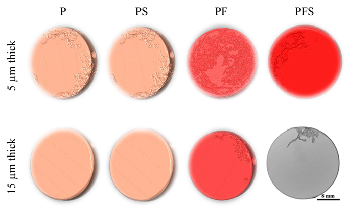
Figure 7. XCT reconstruction of corroded sample.
Let’s be honest: if your figure is messy, dull, and visually unappealing… You’ve already lost your reader, at first glance.
In Figure 7, we see a poorly designed, visually tiring image. If this figure had been crafted more thoughtfully, the colors would speak, the layout would breathe, and the structure would be clear. But it wasn’t.
Because this figure wasn’t designed — it was simply generated, without intention.
Now compare it to Figure 8. The same type of data, but presented with more care and visual clarity.
If you were the author, which image would you choose for your article?
Figure 8. XCT reconstruction of corroded samples [1].
And yes — in every figure I design, I always include a scale bar. Not because it’s optional, because it’s a scientific obligation.
a) Use of Color: Beyond Visual Aesthetics, Ensure Semantic Clarity
- Color is not just for decoration, it must convey meaning.
When presenting directional data (e.g., rolling, transverse, longitudinal), always assign consistent colors to each direction across all graphs. This way, the reader can interpret your data more quickly and accurately, often by following just the color cues. Consistency reduces cognitive load and helps the viewer build visual memory throughout the paper.
In Figure 9, the same color coding is used for the same specimen types in both graphs. As a result, readers moving from one figure to another are not forced to re-learn what each color represents, they can stay focused on the data itself.
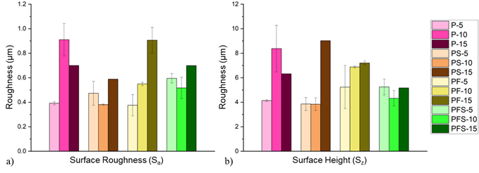
Figure 9. (a) Surface roughness and (b) surface height of samples with different coating thicknesses and compositions [1].
• Consider Colour Blindness: Common types of colour blindness make it difficult to distinguish between red and green. Therefore, these two colors should not be used together. For color selection, color-blind-friendly sources such as Color Universal Design (CUD) palettes or ColorBrewer can be utilized.
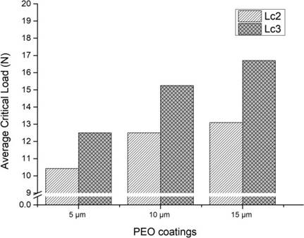
Figure 10. Average critical load values obtained from the scratch test [1].
• Mind the Print: Designing Figures for Grayscale and Accessibility: While many of us read papers on screens, a surprising number of researchers still print out articles, scribbling notes in the margins or sketching directly on the figures (see Figure 10). In these cases, your carefully chosen colour palette simply disappears.
That’s why figure design must anticipate loss of colour and still remain clear, interpretable, and effective.
- For line graphs, vary line styles (e.g., solid, dashed, dotted) and use distinctive markers (squares, circles, triangles) to differentiate datasets.
- For bar charts, employ patterned fills — such as stripes, cross-hatching, or dot textures — to ensure the bars remain distinguishable, even in grayscale.
• Pay attention to contrast: A pale line on a pale background might look elegant on your screen, but it becomes invisible in print. The rule is simple: high contrast wins. Light backgrounds need dark data lines; dark backgrounds need light lines. No excuses. And if your colours bleed into each other? That’s not just a design flaw — it’s a scientific communication failure.
b) Typography and Font Size: Readability Is Not Cosmetic — It’s Scientific
Let’s be clear: legibility in figures is non-negotiable. Every label, axis title, annotation, and legend must be large enough to read without strain. The bare minimum is typically 8 pt, but even that can prove too small, particularly when printed.
As a rule of thumb, I recommend 11–12 pt for most figure text. It offers clarity both on-screen and in print, and — more importantly — spares the reader from squinting or guessing.
And yes, Figure 11 below is an example of what not to do.
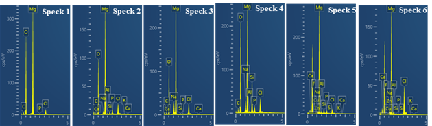
Figure 11. EDX spectrum analysis.
When it comes to font choice, habit is no substitute for intention. You might default to Times New Roman — and that’s perfectly fine for main text — but figures benefit from a cleaner, more structured look. That’s where sans-serif fonts (like Arial or Helvetica) shine: they’re uncluttered, modern, and easier to read at small sizes.
In contrast, serif fonts in complex figures can create visual noise, especially when characters sit close together — making your data harder to read and your figure less effective.
Lastly — and critically — stick to symbol and unit conventions. Don’t just write “Stress” or “Hardness” and call it a day. Use internationally recognised notations like: σ (MPa), Displacement (mm), Hardness (HV). This not only improves clarity, but also ensures that your figure can stand alone, even outside the context of your main text. Unlabelled axes and vague labels aren’t just sloppy — they’re scientific liabilities.
c) Visual Hierarchy and Composition:
A Scientific Figure Is Not a Collage — It’s a Narrative in Design
A well-crafted figure is not a random cluster of charts and images thrown together.
It is a visual narrative — a purposeful composition that guides the reader’s eye and supports your scientific argument.
- Control the reader’s gaze: Most readers scan figures from top to bottom and left to right. This makes the top-left corner prime visual real estate — the first place a viewer is likely to look. So if your key data point is buried in a lower corner or squeezed to the side, chances are it’ll be missed entirely.
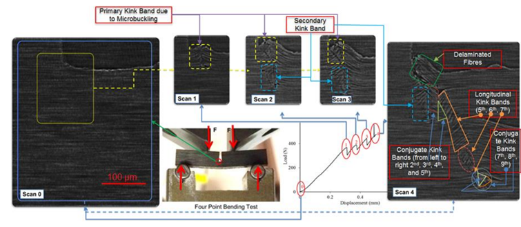
Figure 12. Consequtive XCT data taken during a four point bending test [2].
- Place legends wisely: If your figure includes multiple groups or data categories, avoid shoving the legend off to the margins or outside the frame. A well-integrated legend — placed thoughtfully within the figure — minimizes eye movement and reduces cognitive load. Don’t make your reader play ping-pong between figure and explanation.
- Handle multi-panel figures with structure: Panel figures (a, b, c…) are often where good intentions fall apart. Common pitfalls include:
- failing to label subfigures,
- presenting panels in an illogical or inconsistent order,
- writing captions that don’t match the visual flow.
To do it right:
- ✅ Label each subfigure using lowercase letters in parentheses: (a), (b), (c)…
- ✅ Arrange panels logically and symmetrically:
• Left to right for horizontal layouts. Top to bottom for vertical layouts
- ✅ In the caption, provide a concise, meaningful description for each panel, following
Remember:
A figure is not just a visual — it’s a narrative journey.
And you are the guide on that journey.
No matter how strong or striking your data may be…
⚠️ Poor placement will dull its impact.
⚠️ Mispositioned information will lose its power — or go entirely unnoticed.
That’s why visual hierarchy is not merely an aesthetic choice —
it is a reflection of your scientific responsibility.
Because a poorly designed figure can become the weakest link in an otherwise well-written paper.